The digital design world is constantly evolving. From early static websites to modern responsive platforms, designers and developers continuously search for better ways to build flexible and user-friendly interfaces. One emerging concept gaining attention in modern web design is Pxless.
If you have recently encountered the term Pxless while researching web design, UI/UX development, or responsive design strategies, you might wonder what it actually means. Is it a tool, a design philosophy, or a new framework?
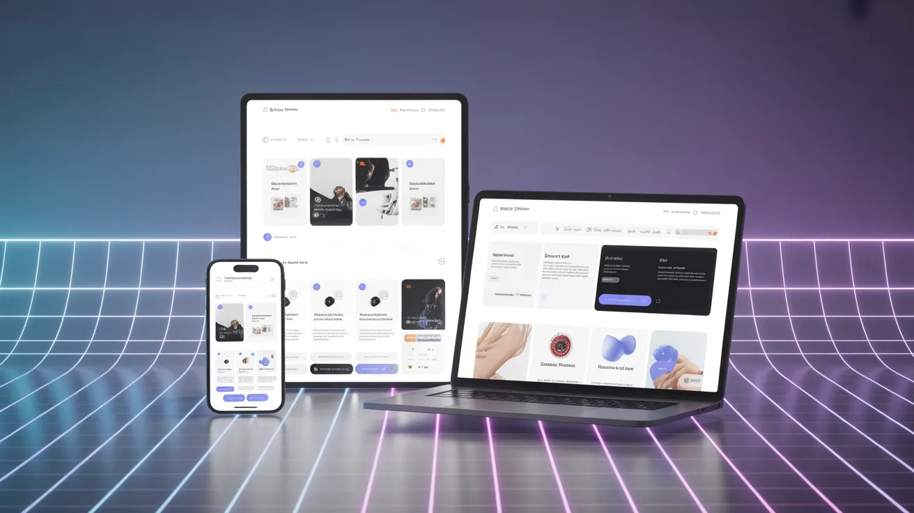
In reality, Pxless represents a modern approach to digital design that reduces reliance on fixed pixel measurements and focuses on scalable, flexible layouts. This concept is becoming increasingly relevant as users access websites from a wide variety of devices—smartphones, tablets, laptops, smart TVs, and even wearable technology.
This comprehensive guide will explain everything you need to know about Pxless, including its meaning, how it works, benefits, challenges, tools, real-world examples, and why it may shape the future of web development.
What Is Pxless?
Pxless refers to a design and development philosophy that minimizes dependence on fixed pixel values when building digital interfaces. Instead of using rigid measurements like 200px or 16px, designers rely on relative units, fluid layouts, and scalable design systems that adapt naturally to different screen sizes and resolutions.
The term itself comes from two parts:
- px → the abbreviation for pixels in web design
- less → meaning reduced reliance
Therefore, Pxless essentially means “less dependency on pixels.”
Traditional design approaches relied heavily on precise pixel measurements because most screens had similar resolutions. However, modern devices vary greatly in screen size and density, making pixel-perfect layouts difficult to maintain across platforms.
Pxless solves this problem by emphasizing fluid design instead of rigid layouts.
Why Pxless Is Becoming Popular
The rise of Pxless is closely tied to changes in technology and user behavior.
Today, people access websites from many different devices:
- Smartphones
- Tablets
- Desktop computers
- Foldable phones
- Smart TVs
- Wearables
A layout designed strictly with pixel measurements often breaks when viewed on different screens. Buttons may overlap, text becomes unreadable, and images appear distorted.
Pxless addresses this issue by allowing elements to adapt dynamically based on screen size, container width, or user preferences.
Some major trends pushing the adoption of Pxless include:
- Mobile-first web design
- Responsive frameworks
- Accessibility standards
- Flexible design systems
- AI-driven design tools
Because of these factors, many modern websites are gradually shifting toward Pxless design methods
Traditional Pixel-Based Design vs Pxless Design
To better understand Pxless, it helps to compare it with traditional pixel-based design.
| Feature | Pixel-Based Design | Pxless Design |
|---|---|---|
| Layout measurements | Fixed pixels (px) | Relative units (%, rem, em, vw) |
| Flexibility | Low | High |
| Device compatibility | Limited | Cross-device |
| Maintenance | Requires constant adjustments | Easier to maintain |
| Accessibility | Often breaks on zoom | Works well with scaling |
| Future scalability | Limited | Future-proof |
Traditional designs attempt to control every detail of a layout. Pxless, on the other hand, focuses on relationships and proportions rather than exact numbers.
Core Principles of Pxless Design
Several key principles define the Pxless philosophy.
1. Fluid Layouts
Instead of fixed widths like 1200px, Pxless designs often use percentages or container-based layouts.
Example:
width: 80%;
This ensures the layout automatically adjusts depending on screen size.
2. Relative Units Instead of Pixels
Pxless heavily relies on units such as:
rememvwvh%
These units scale based on context, making designs more flexible.
Example:
font-size: 1.2rem;
3. Content-Driven Layouts
In Pxless design, content determines the layout, not the other way around.
For example:
- Text length adjusts container height
- Images scale with screen width
- Components resize automatically
4. Scalable Typography
Typography plays a crucial role in Pxless systems.
Using relative units ensures text remains readable across devices and user settings.
Example:
font-size: clamp(1rem, 2vw, 2rem);
5. Flexible Components
Design systems often include components that adapt based on their container.
Examples include:
- Buttons
- Cards
- Navigation bars
- Product grids
These elements automatically resize without needing pixel-based adjustments.
How Pxless Works in Web Development
Developers implement Pxless design using modern CSS techniques.
Common methods include:
1. CSS Flexbox
Allows elements to expand or shrink depending on available space.
2. CSS Grid
Creates flexible layouts that adapt automatically.
3. Responsive Typography
Fonts adjust using viewport units or scalable values.
4. Container Queries
Components adapt based on their parent container size.
Benefits of Pxless Design
Pxless offers several significant advantages for designers, developers, and businesses.
1. Better Responsiveness
Layouts automatically adapt to different devices.
This improves user experience and reduces design breakage.
2. Improved Accessibility
Pxless supports user settings like:
- Zoom
- Larger fonts
- Screen readers
This makes websites more inclusive for people with visual impairments.
3. Faster Development Workflow
Developers spend less time fixing layout issues across multiple devices.
4. Future-Proof Design
New devices constantly emerge with different resolutions.
Pxless designs adapt naturally without major redesigns.
5. Better Performance
Using scalable assets like SVG graphics often reduces file sizes and improves loading speed.
Real-World Examples of Pxless Design
Many modern websites already apply Pxless principles.
Examples include:
- SaaS dashboards
- News websites
- E-commerce platforms
- Web apps
- Mobile applications
For instance, companies that use responsive design frameworks often rely on Pxless techniques to ensure consistent experiences across devices.
You can explore responsive design fundamentals on World Wide Web Consortium guidelines for web standards.
Tools That Support Pxless Design
Several modern tools make Pxless development easier.
Design Tools
- Figma
- Adobe XD
- Sketch
These tools support responsive layouts and component-based design.
Development Frameworks
Popular frameworks supporting Pxless workflows include:
- Tailwind CSS
- Bootstrap
- React
These frameworks allow developers to build scalable UI systems quickly.
Pxless and Responsive Web Design
Pxless is closely related to responsive web design, but it goes a step further.
Responsive design typically uses breakpoints like:
- 768px
- 1024px
- 1440px
Pxless focuses more on continuous adaptability rather than fixed breakpoints.
Learn more about responsive design on MDN Web Docs.
Challenges of Using Pxless
Although Pxless has many advantages, it also presents certain challenges.
Learning Curve
Designers accustomed to pixel-perfect layouts may initially struggle with flexible systems.
Complexity in Design Systems
Building scalable components requires careful planning.
Without proper rules, layouts may become inconsistent.
Tool Limitations
Some older design tools still rely heavily on pixel-based measurements.
Best Practices for Implementing Pxless
If you want to adopt Pxless design, follow these best practices:
Start With a Design System
Create consistent rules for:
- Typography
- Spacing
- Layout grids
Use Relative Units
Avoid fixed pixel values whenever possible.
Test on Multiple Devices
Check designs on phones, tablets, and desktops.
Prioritize Accessibility
Ensure text remains readable when users zoom or increase font size.
SEO Benefits of Pxless Websites
Pxless can indirectly improve search engine optimization.
Benefits include:
- Faster loading speed
- Better mobile usability
- Improved user engagement
- Reduced bounce rates
Search engines like Google prioritize mobile-friendly websites, making Pxless a strong strategy for SEO.
Image Suggestions (SEO Alt Text)
Use these image ideas in your article.
Image 1: Responsive layout comparison
Alt text: Pxless vs pixel-based design comparison
Image 2: Fluid typography example
Alt text: Responsive typography using rem units
Image 3: Flexible web layout
Alt text: Pxless responsive grid layout example
Semantic Keywords (LSI Keywords)
Use these related keywords throughout your content:
- pixel-less design
- responsive UI design
- flexible web layouts
- scalable typography
- adaptive web design
- fluid grids
- responsive frameworks
FAQ About Pxless
What does Pxless mean?
Pxless refers to a design approach that reduces reliance on fixed pixel measurements and instead uses flexible units and scalable layouts.
Is Pxless the same as responsive design?
Not exactly. Responsive design uses breakpoints, while Pxless focuses on flexible layouts that adapt continuously.
Why is Pxless important?
It helps websites adapt across devices, improves accessibility, and reduces maintenance costs.
Can Pxless improve website performance?
Yes. Pxless often uses scalable assets and simpler layouts, which can improve loading speed and performance.
Is Pxless difficult to implement?
Initially it may require a mindset shift, but modern frameworks make it easier to implement.
The Future of Pxless Design
As technology continues to evolve, Pxless may become the standard approach for digital interfaces.
Future innovations like:
- AR/VR interfaces
- foldable devices
- AI-driven UI systems
require flexible design systems rather than rigid pixel layouts.
Pxless aligns perfectly with this direction because it focuses on adaptability and user-centered design.
Conclusion
Pxless represents a powerful shift in how digital products are designed and developed. Instead of focusing on pixel-perfect layouts, Pxless prioritizes flexibility, scalability, and user experience.
By using fluid grids, relative units, and adaptable components, designers can create interfaces that work seamlessly across all devices.
As the number of screen sizes and devices continues to grow, the Pxless approach offers a future-proof solution for modern digital design.
If you are a web designer, developer, or business owner building digital products, understanding Pxless can help you create more responsive, accessible, and scalable experiences.